Sample critiques

Four photographs.
Four close readings.

These responses were produced by the current critique engine. Each begins with the photograph, then follows the mood, the path of attention, the tradeoffs and the decisions that may genuinely help.

Sample one

Lisbon at night.

A street held together by lamplight, distance and two small points of color.
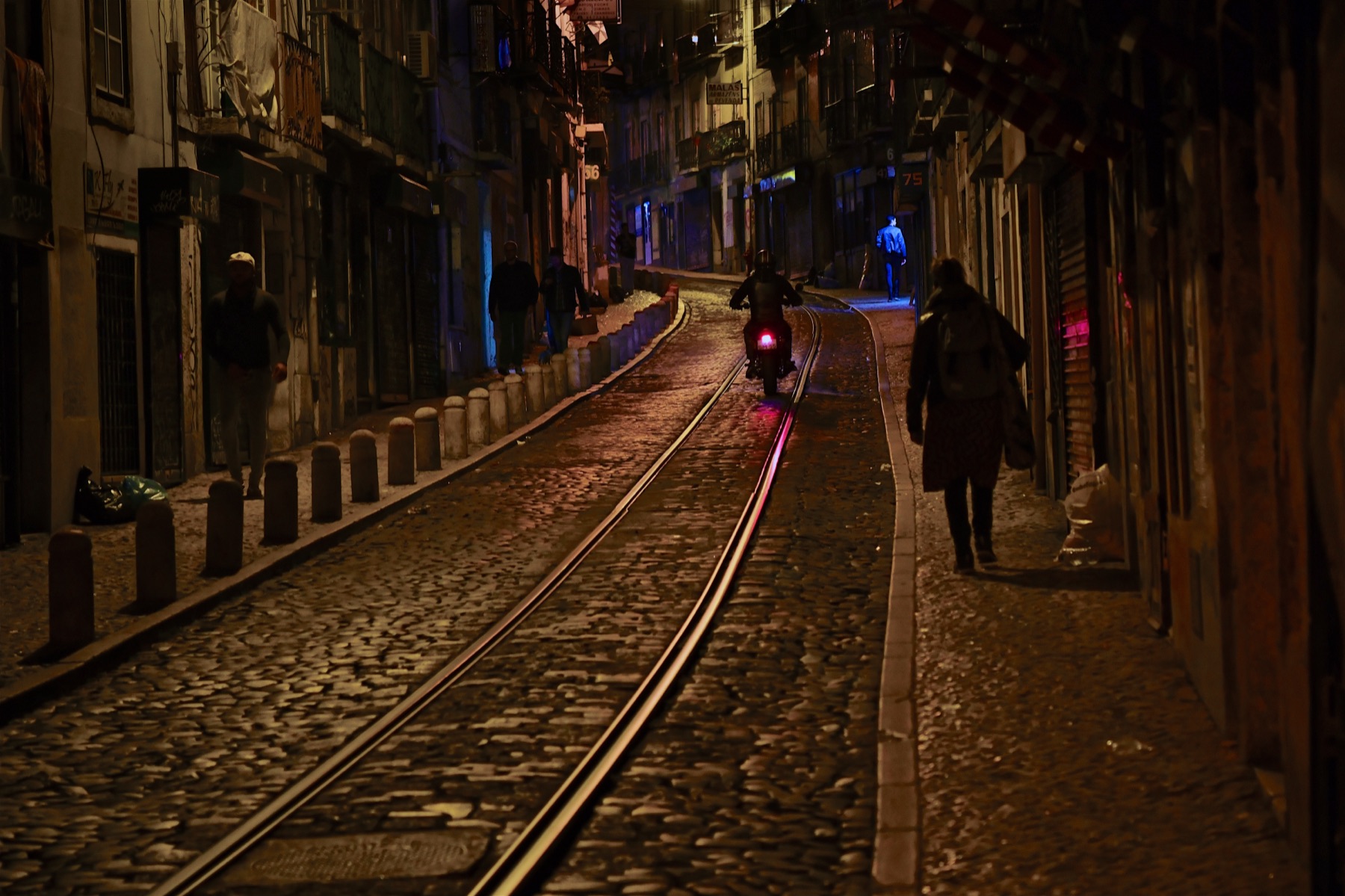
A motorbike and scattered figures on a dark cobbled street crossed by tram rails and colored light
Photograph © Steve Simon

Red and Blue Inside the Lamplight

This Lisbon street at night is carried by its light, warm lamplight on wet cobbles broken by one red glow and one blue figure. The rails pull you up the hill, and the people are spread through the frame with room around each of them. What it adds up to is a picture of a place and an hour, more than of anyone in it.

This is close, a very good night picture a shade short of strong. The light, the rails and the restraint of the palette do the heavy lifting, and the frame organizes a lot without feeling busy. What costs it is that every person is small and dark, nobody steps into the colored light that makes the picture, and the largest figure sinks into the shutters behind her.

Where the eye goes

The rails take me in from the bottom left corner and deliver me to the motorcyclist at the center, where the red light sits and its reflection runs back down the wet stones toward me. From there the eye finds the blue jacket further up, then drifts left to the man in the pale cap, the one face with real light on it. The woman on the right comes last.

What’s working

The mood is the content here. Wet cobbles, a single red light coming at you, figures walking both ways in the dark: it reads as quiet and late, and to me a little uneasy, as if the street could turn either way. The color is restrained, one warm family of tones with cool blue and red as accents, which is exactly why those accents register. Nobody overlaps anybody, the bollards set a rhythm up the left, and the moment catches the bike where the red reflection is longest.

What’s holding it back

The people never get their turn. The motorcyclist is the main star by position and light, but the rider is a dark shape at mid distance, and the blue figure, the most intriguing presence in the frame, is tiny. The woman on the right is the biggest figure and the least visible, her head and coat merging with the near-black shutters, so the heavy right third becomes a wall rather than a layer.

Crop and post-processing

I would not crop this. The dark right edge frames the woman and trimming it would push her against the edge. Finishing can do the real work:

  • The woman on the right: a local shadow lift on her head, coat and backpack, roughly a third of a stop, so she separates from the shutters while keeping the dark feel.
  • The striped object top right: local darkening, a small amount, until it stops competing with the red light.
  • Shadows throughout: AI noise reduction in your editing software, moderate strength.

Next time out

A street like this gives you a structure that will hold still: the rails, the lamplight, the blue and the pink glow on the walls. The pieces that move are the people. Set the frame, then wait for someone to walk into one of those colored pools, close enough to carry some size, and keep shooting as a bike comes nearer so the red streak grows longer with each frame. Choose the one where a person and the light meet.
Sample two

Times Square, 2000.

A kiss at the turn of the millennium, close enough to feel intimate and wide enough to keep the square alive.

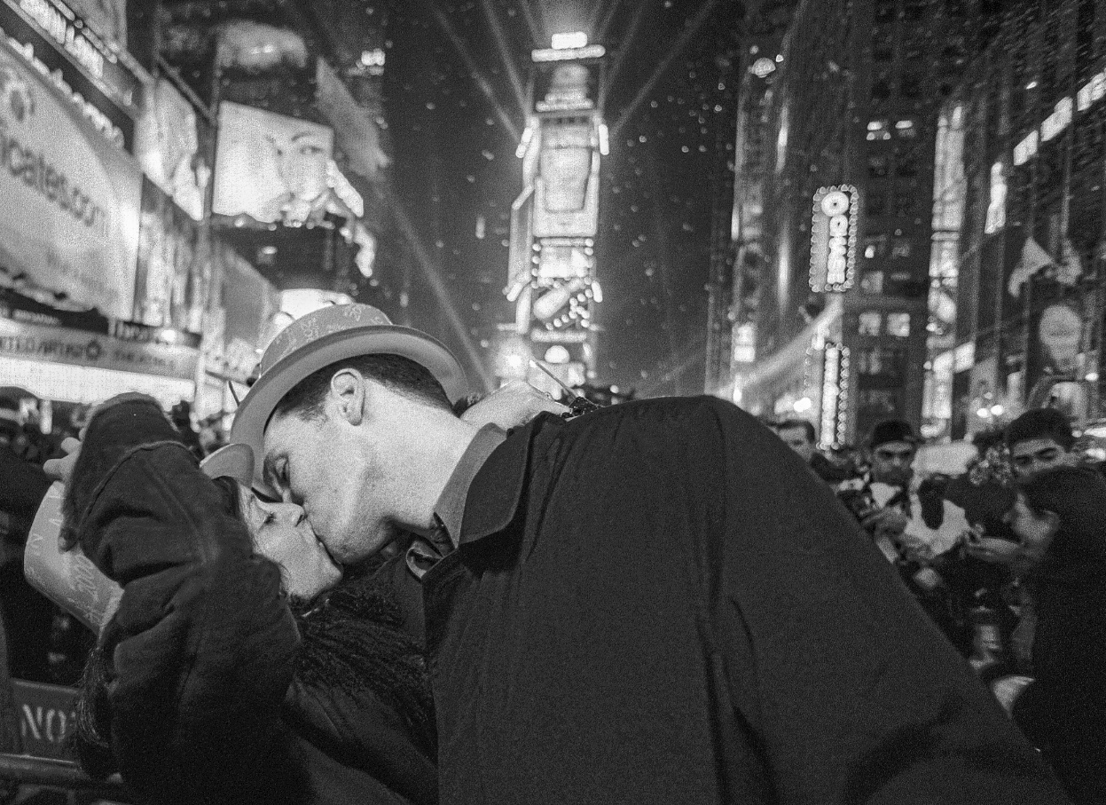
A couple kissing amid the lights and crowd in Times Square as 1999 turned to 2000
Photograph © Steve Simon

A Kiss at the Turn of the Millennium

Portfolio candidate

This kiss in Times Square as 1999 turned to 2000 works because a private moment at its fullest sits inside one of the most public nights anyone could name. The crowd, the towers and the confetti say where and when, and the two closed-eyed faces say none of that matters to them. The tension, for me, is between the noise of the place and the quiet of the kiss.

This is the kind of picture worth considering for a portfolio. The kiss is at its peak, both faces read, the setting dates it to the hour without a caption, and the roughness serves the mood instead of fighting it.

Where the eye goes

His lit profile and the pale brim of the hat pull me in first, just left of center, and from there I drop to her upturned face. The bright tower behind his hat lifts me up into the confetti, I drift right across the soft crowd faces behind his shoulder, then come back to the kiss. The big dark coat in the lower right holds all of that in place.

What’s working

The moment is the whole picture, and it is at its height. His mouth is on hers, she is dipped back, both sets of eyes are shut. Nothing about it looks arranged for you, and the crowd confirms it: not one of the faces behind him is watching the couple, which is what makes it feel stolen from a real night rather than staged in one. It is hard not to think of Eisenstaedt's V-J Day kiss in Times Square, but this frame is its own thing: lower, closer and more private, the couple sealed off from the chaos instead of performing in it.

The two faces sit in front, the crowd makes a middle band of soft faces and caps, and the towers and falling confetti fill the back, each layer softer as it recedes. The hat sits against the lit tower, so his head separates cleanly, and the heavy grain and blown signs give the whole thing the texture of a night too bright and too loud to render politely.

What would make it even stronger

A minor point. Her dark hair runs into his dark collar and coat, so the outline of her head is mostly lost and the kiss leans on his profile to carry the shape. A touch more separation there would let two heads read instead of one.

Crop and post-processing

No crop. The tilt, the cut at the bottom and the coat filling the corner all belong to the night.

  • Her hair against his collar and coat: a small local shadow lift along the edge of her head, enough to find the outline and no more. Stop before the coat turns grey or the grain in that patch looks lighter than the rest.

Next time out

On a night with an obvious main event, the countdown, the ball, the fireworks, the better picture is often the one you find by turning your back on it. You did that here: close, low, inside the crowd, aimed at two people who had forgotten the occasion. Keep that habit, and stay after the clock has turned, because the frames made while everyone else is packing up often outlast the event.

Sample three

The one who waits.

A rehearsal photographed with the focus on the dancer who isn’t dancing, given to the engine with no notes.

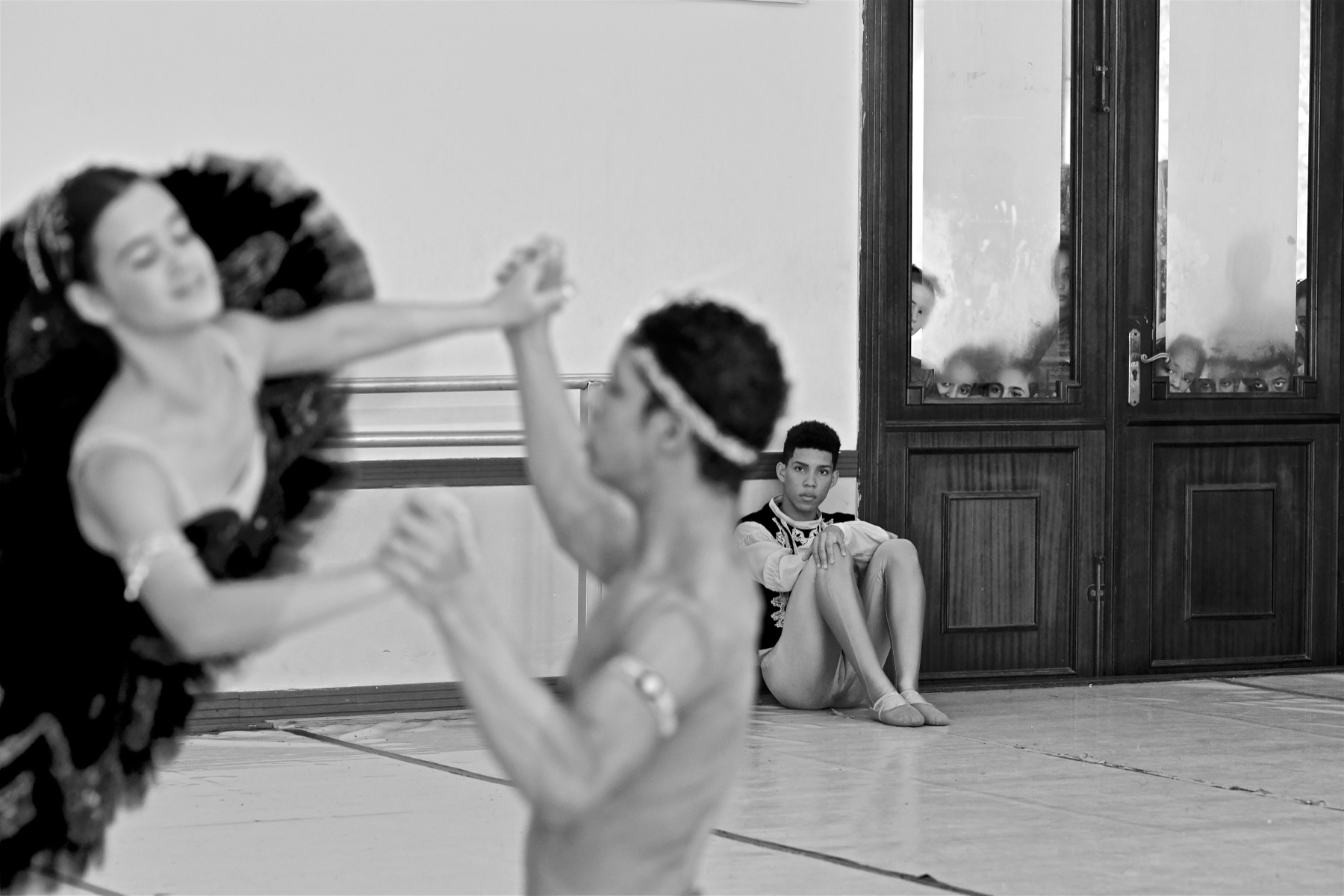
Two dancers swirling past in soft focus while a young man in costume sits sharp against the wall and looks at the camera
Photograph © Steve Simon

The Dancer Who Waits His Turn

Portfolio candidate

This rehearsal picture works because it puts the sharp focus on the one person who is not dancing. The pair in the foreground swirl past as soft shapes, and the young man seated against the wall, in costume and waiting, looks straight out at the viewer with a face that is hard to read. Behind him, faces pressed to the glass watch the same room.

This is a strong picture and the kind worth considering for a portfolio. The plane of focus is the whole idea, and it lands: the viewer is placed with the dancer who waits rather than with the dance. I see nothing in the bones that costs it.

Where the eye goes

The dark mass of the tutu and the clasped hands at the top center pull attention first, by size and tone. Because both are soft, the eye does not stay. It slides right along the barre and stops on the seated dancer, the only crisp thing in the room, and his direct look holds it. The last discovery is the glass of the door, where several faces and pairs of eyes sit just above the wooden rail. They are low in contrast and come late, and on a phone screen they may vanish altogether. At print size or a large screen they turn the frame into three layers of watching: the dancers absorbed in each other, the costumed dancer watching us, and the onlookers behind the glass watching him.

What’s working

The focus choice is the picture. Sharp dancers and a soft onlooker would have been the picture everyone makes. Reversed, the dance becomes atmosphere and the waiting becomes the subject.

The seated dancer's expression is the Mona Lisa factor at work. He could be bored, anxious, resentful or simply resting, and the picture lets the viewer decide. His knees drawn up and hands locked around one knee read as patience held in. The costume matters too: the embroidered vest and white sleeves say he is not a spectator but a performer, which makes his stillness carry weight.

The structure helps everything read. Pale wall and floor on the left, dark door on the right, and the three groups of figures spaced across the middle so none crowds another. Black and white suits this: the wood, the wall and the skin all fall into a narrow family of tones, and no stray color competes with the faces.

What would make it even stronger

Minor, and only visible once you look for it: the end of the barre passes just above his head rather than clearly over it, so the top of his hair sits very close to that line. If the moment had allowed it, a slightly higher camera would have put a little more plain wall between his head and the barre, with the barre clearly above him. It is a near miss, not a merger, and the picture carries it easily.

I would not crop. The tutu running off the left edge and the partner cut at the waist both keep the pair as motion passing through the frame rather than posed subjects. The tonal balance already serves the idea, so I would leave the file alone.

Next time out

In a room where the main action is obvious, the dancers, the ceremony, the speech, spend some of your frames with the focus on whoever is waiting, resting or watching, and let the action blur in front of them. Then do the reverse for the same scene so the choice can be made in the edit. Here the instinct went the right way, and it is a habit worth keeping, because the person at the edge of the event often tells the truer story about it.

Sample four

Read cold.

One of the most famous photographs ever made, given to the engine with no title and no notes.

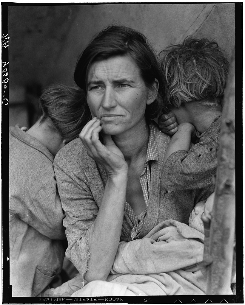
A mother with a worried expression, hand at her chin, two children hiding their faces against her shoulders and a baby in her lap
Dorothea Lange, Migrant Mother, Nipomo, California, 1936. Library of Congress, Prints & Photographs Division, FSA/OWI Collection.

Three Hidden Faces Around One Worried Gaze

Portfolio candidate

This is Dorothea Lange's Migrant Mother, and taken simply as a frame it works because one woman's worried, unreadable gaze and the hand at her mouth hold attention long after the first look. What I see is a face surrounded by people who have hidden theirs, and that is both the structure and the feeling of the picture. The worry is plain, but where it is aimed stays open.

This is a portfolio candidate, and there is little in the bones to change. The expression carries it, the turned-away children frame the face without competing with it, and the focus lands exactly where it must. Only the photographer can weigh it against the rest of their work, but the picture itself asks for nothing more.

Where the eye goes

Her eyes take me first. They are the sharpest thing in the frame and the brightest skin, and the drawn brow and closed, downturned mouth keep me there. The raised hand at the corner of her mouth is the second stop, and the forearm running straight down the middle carries me to the pale bundle in her lap. The two light heads on either side come last, and because both faces are pressed into her shoulders they send me straight back to hers. The one thing that tugs me out is the mirrored film lettering across the bottom rebate. Words always pull, and these have nothing to do with the woman.

What’s working

The moment is the picture. Her lips are closed and her gaze goes past the camera to the left, slightly down, so the viewer never gets to settle what she is thinking. A direct look or an open mouth would have made this easier to read and weaker. The hand doing the thinking for her is a gesture that still feels unposed.

The supporting players are arranged with real discipline. Hiding the children makes them a shelter around her rather than three more subjects, and it adds the sense that they lean on her while she has no one to lean on. The soft, even light from the left suits that.

Centered placement breaks the guide of thirds and is right here. The symmetry of a child on each side is what makes the center the only place her face could sit.

Crop and post-processing

The one real decision is the rebate. If presenting the full negative with its handwriting and film lettering is a deliberate archival look, keep it, and know that the text will always take a little attention. If it is not, crop to the picture edge and lose nothing but the border.

  • Canvas directly above the right child's hair: a local darkening brush, Exposure around -0.2, to give the hair a touch of edge. Stop before the canvas looks dirty.

Next time out

When one face is the whole story, look at what every other face in the frame is doing. Here they are all turned away, and that is why hers has no rival. In a crowded family moment, waiting for the others to turn in, or shifting a half step so they do, is worth more than any adjustment later.

From the beta

“I especially like the detailed observations it makes and the thoughtful editing / processing suggestions.”

Craig Vought

“In short I found it extremely valuable and generally in-keeping with comments the photos have received in the past. As a result of the THOROUGH critique provided by your software, I am going to do precisely what the system suggested.”

Bob Levy

“Truly impressive. I can’t imagine the work involved to get it to this point. It was very descriptive and on point.”

Mitchell Bloch